Brief UI update.
Ditched ElvUI because I found myself fiddling and fiddling and fiddling to try to change little tiny things. Backgrounds too dark, okay, tweak that. Borders too dark, okay, tweak that. Make buttons look different, fonts, move this move that move this move that, okay, add in this add in that… it wasn’t as simple as I had hoped. I also felt … out of control of my interface? Does that make sense? Like, everything was now dark and un-Warcraft-like.
Tried RealUI on the basis of recommendations on Twitter. Total UI replacement, all the way down to the login screen. LUA errors on launch, hated the fonts, disliked the HUD. I appear to be really fussy about fonts, which is not really a surprise when you consider that one reason I continue to use a Mac is because of how beautiful fonts render on it.
Went back to default but started adding in addons I liked – tried a few action bar mods, settled back on Bartender even though it has some problems (like using its own action bars instead of the default ones, so the bindings don’t show up properly on the screen, or inability to handle flyouts if you don’t use their bars.) I went for BT because it allowed me to put the bars into a grid like the Naga thumb pad, which I think is actually kinda important visually. I will shrink them later, but for now the three 3×4 pads are my main keys.
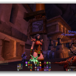
- Center cluster is unmodified DPS (1-12).
- Right cluster is defense and CDs, accessed with Opt or Caps Lock.
- Far right (small) is the pet bar, accessed by Ctrl.
- Left cluster is utility, accessed by Opt/Caps + Shift.
- By avoiding macros, the Center cluster doubles as the focus target DPS by pressing Shift and setting the default interface correctly.
Rebinding the Caps Lock key to Alt/Option has been an important change for me, and one of the big issues to overcome is to STOP contorting my hands to hit Shift or Ctrl (my previous binds).
One piece of advice – work on the binds first before the UI. I’m pretty happy with my key layout at this point, making small modifications as necessary but nothing is glaringly awful. I see that I’m faster to click flags and objectives.
But having a consistent underpinning on the keyboard has been important while trying out these UI modifications. Yeah, I’m still struggling to move, but I’m not moving stuff around anymore. Now it’s a question of look and feel and utility and responsiveness, not of keyboard interface.
Aside: this warlock outfit – with the horns – should have a name. I know both Zable and Snack’s warlocks have been in it, and I have no regrets.
(Though it is a little drafty.)